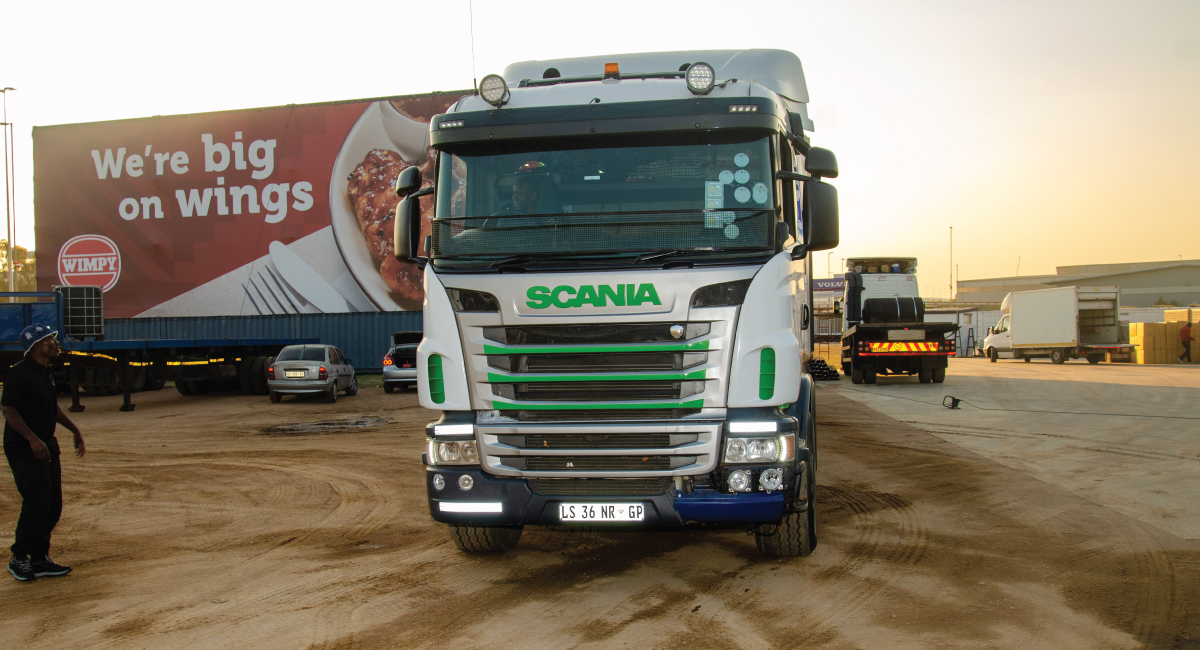
Freight logistics
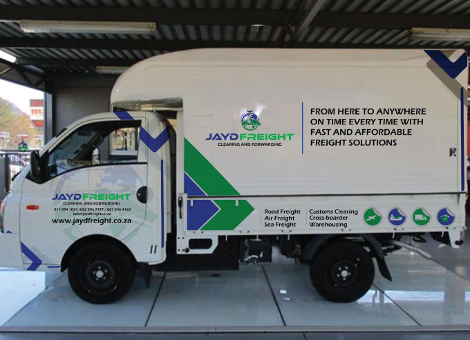
Bold shapes and powerful colors form the backbone of the new Jayd brand. The identity design is as flexible as it is scalable and
works great at every touchpoint. The logo with its industrial character is technically precise and facilitates fast recognition.
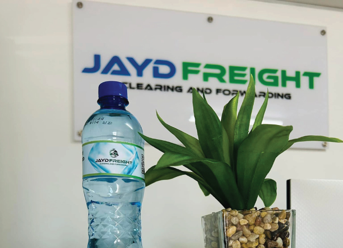
An accurate analysis of competition showed us where Jayd could stand out and be distinctive - color. That’s why we chose to be
vibrantly different from the start and implement lime as the primary brand color. Dark green and blue adds a deep and bold
contrast. This makes the Jayd distinctive and impactful.
The brand typeface Montserrat Subrayada underlines the technical and reliable character of Innomotics with its simple yet bold
shapes.
Project info
- Brand strategy
- Brand communications (internal and external)
- Web and app design & development
- Spatial design